
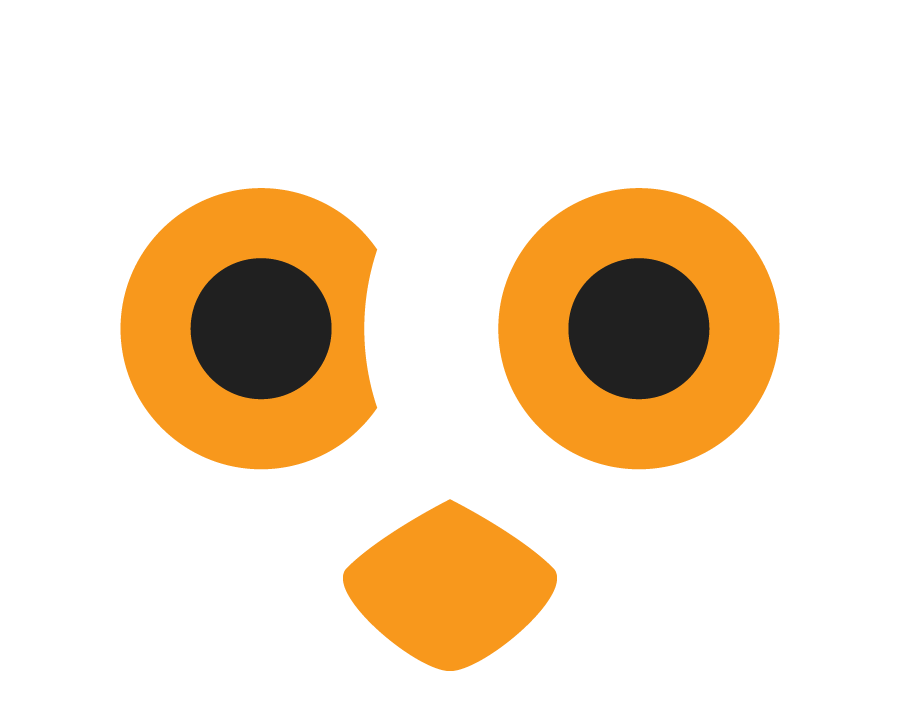
This is Oliver, the owl. He's the RCOS mascot and a real hoot.
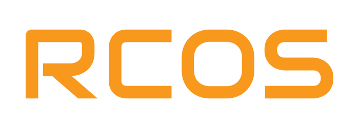
Typography was kept simple, with rounded corners giving a futuristic impression.

The elements of the RCOS logo combine to create a neat, bi-colour, branding symbol.
RCOS is a software development company that needed a logo and branding. The owl used here represents wisdom. The eyes featured exaggerated brows similar to horn-rimmed glasses. Combined with the wide eyes these create an inquisitive expression indicative of the company's focus on knowledge and learning.