
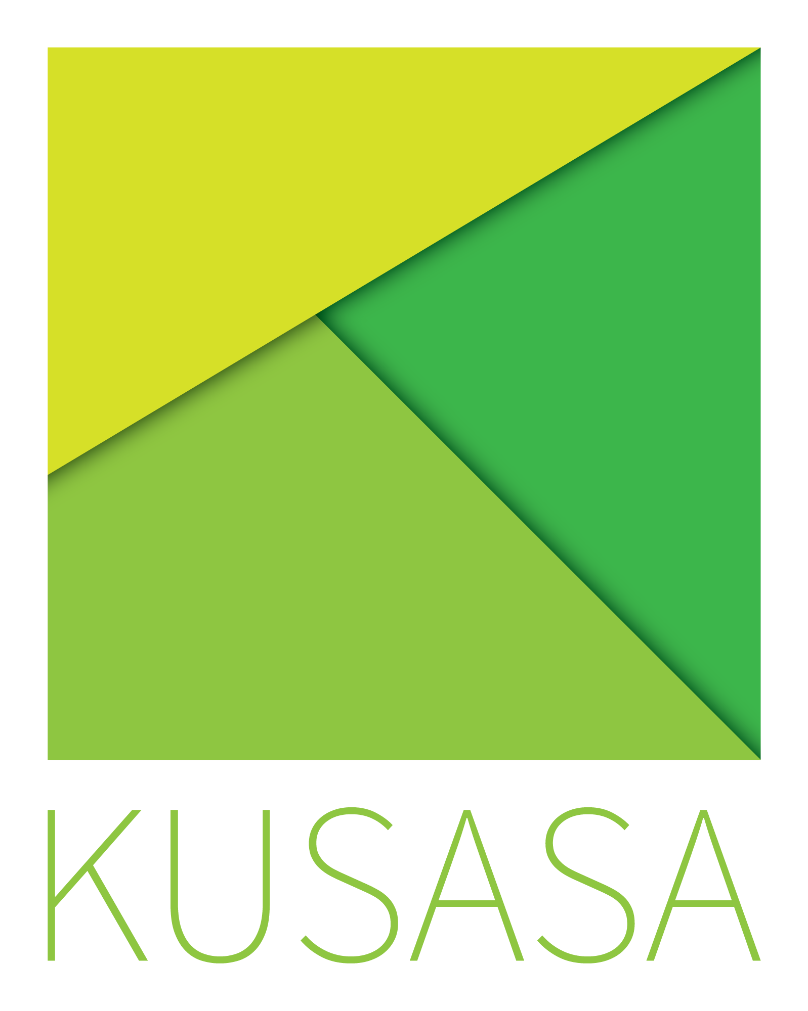
When designing this logo the shape of the K is implied using varying shades of green. The lightest shade represents the sun rising. The middle shade is a mountain to climb or challenge to overcome. The darkest shade is the unknown which is illuminated with each dawn.

When branding print media a square is used to bring the K into focus.